CLIENT:
GLOBAL REINSURANCE COMPANY
ROLE:
SENIOR UX RESEARCHER & DESIGNER
DURATION:
1.5 YEARS
TEAM SIZE:
3 PEOPLE

Rewiring a 25-year-old insurance brain
about.
The backbone of 11 global products, frozen in the architectural paradigms of 1999.
A health insurance configuration platform used by insurers across the globe for over 25 years. Eleven products spanning everything from policy administration to claims adjudication. Built by engineers, for engineers.
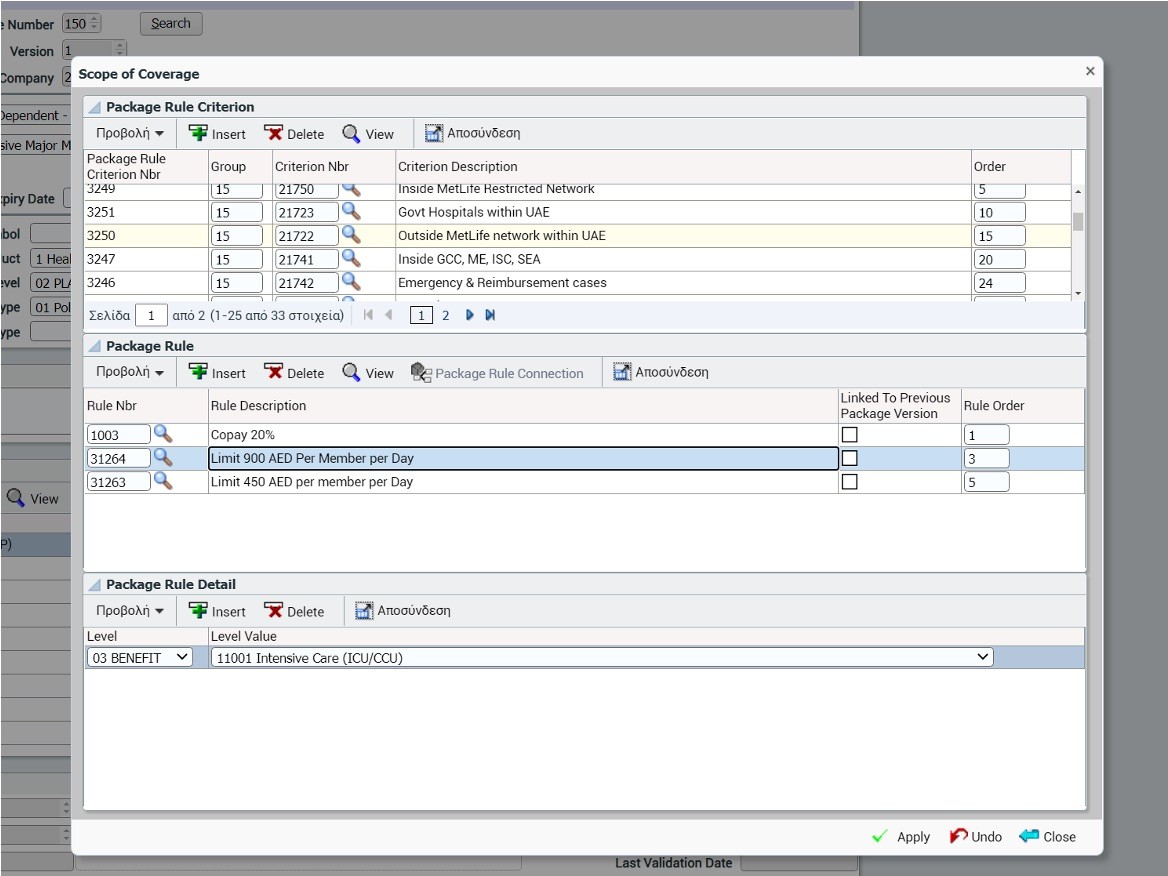
New hires needed months of training before they could complete basic tasks. Core users from client side described working with it as learning a second language.
CHALLENGE #1
Steep learning curve
CHALLENGE #2
Low client adoption
CHALLENGE #3
High support burden
the wrong problem.
The software spoke coding. The user spoke insurance.
Every prior attempt at improvement iterated the interface. Cleaner layouts, better labels, reorganised menus. None of it worked.
My diagnosis, drawn from user interviews, job shadowing, process analysis, and document review across both client and internal teams: the problem wasn't the interface. It was the mental model.
VIVID RESEARCH MOMENT
During a job shadowing session, I watched an internal senior insurance analyst spend 5-hour configuring a straightforward two-tier package. A task that should take 60 minutes. She had ten browser tabs open and was cross-referencing a few handwritten cheat sheets her colleague had taped to the side of his monitor three years ago and a notebook. When I asked if there was official documentation, she laughed.
client testimonial.
Every time I need to set up a new package, I call Dimitra because she's the only one who remembers how the conditions connect. If she's on holiday, call the customer support.

David
Senior Business Development Specialist, Insurance Company
4 themes from the research.
01
Complex technical logic (AND / OR / NOT) required for basic tasks.
System designed for an engineering mindset, not insurance professionals.
02
No visual mental model of dependency chains.
03
High cognitive load during context switching and fragmented workflow. Users opened multiple browser tabs to find information needed to complete tasks.
04
Tribal knowledge as the only source of truth. "Mouth-to-mouth" tips known internally but never transferred to clients.
the flip.
We didn't redesign the interface. We inverted the conceptual model.
We brought design thinking into an organisation that had operated for 25 years without a design team. For the first time, product decisions were shaped by user research and usability evidence; shifting the culture from engineering-led to user-informed.
BEFORE
Engineering Logic
Condition
Coverage
Plan/Benefit
Condition
Coverage
Plan/Benefit
Start from abstract conditions (IFs), work toward the thing you're building (plans, benefits). Technical. Counterintuitive.
Monolithic Data Silos
Users enter data into void-like fields and pray the validation catches errors after the fact. The system is a recording device.
AFTER
Insurance Workflow
Plan/Benefit
Condition
Coverage
Plan/Benefit
Condition
Coverage
Start from the insurance product you know (plans & benefits), add specificity progressively (conditions). Natural. Intuitive.
Modular Configuration Canvas
The system projects available paths. Users select and configure within a live validation canvas. The system is an advisor.
Proposing a conceptual inversion to an organisation that had built on the existing model for 25 years was not a straightforward conversation. The engineering team saw it as a challenge to their architecture. Senior stakeholders worried about migration risk.
I worked with the business analysts to map the current vs. proposed workflow side by side, and we presented it jointly to stakeholders. Not as a UX recommendation, but as a shared BA and UX proposal grounded in user evidence and business logic. We walked them through the same research moments that had convinced us: the 5hours configuration task, the taped cheat sheets, the clients who had given up and hired vendor analysts instead. The evidence did the persuading. The joint framing did the de-risking.
After sign-off, the BA translated the agreed workflow into detailed business requirements while I moved into design; both working from the same shared foundation.
design strategy.
Translating research into four pillars
No existing design library handled the kind of conditional, nested complexity that insurance configuration demands. We designed these from scratch.
01
Realign to insurance industry workflows
The stepping process now mirrors how insurance professionals actually think.
02
Embed guidance and context within the flow
No more multiple browser tabs. No undocumented tribal knowledge.
03
Replace technical logic with intuitive metaphors
AND/OR/NOT replaced by visual building blocks that insurance people grasp immediately.
04
Ensure consistency with the redesigned suite
Patterns aligned across all modules being redesigned in parallel.
configuration canvas.
Same tasks. Same density. Visual relief.


components.
Components we had to invent.
No existing design library handled the kind of conditional, nested complexity that insurance configuration demands. We designed these from scratch.
COMPONENT 01
Coverage Rule Builder
WHAT IT REPLACES
A flat table of AND/OR/NOT conditions that users had to construct manually. Essentially writing database queries without knowing it.
WHY WE INVENTED IT
Insurance rules are inherently nested and conditional. "If this benefit is active AND the member presents at a hospital emergency department with an injury, THEN apply this sub-limit." We designed a visual builder that lets users construct rules by stacking and nesting blocks; making the logic visible without requiring technical vocabulary.


COMPONENT 02
Contextual Scope Panel
WHAT IT REPLACES
The multi-tab workflow. Users previously opened 3–4 browser tabs to cross-reference benefit definitions, plan structures, and existing coverage rules while configuring a new package.
WHY WE INVENTED IT
We built a slide-out panel that surfaces relevant context. Existing coverage rules, benefit definitions, and plan-level constraints — directly within the configuration flow. The panel adapts its content based on where the user is in the workflow, eliminating the need to navigate away.
COMPONENT 03
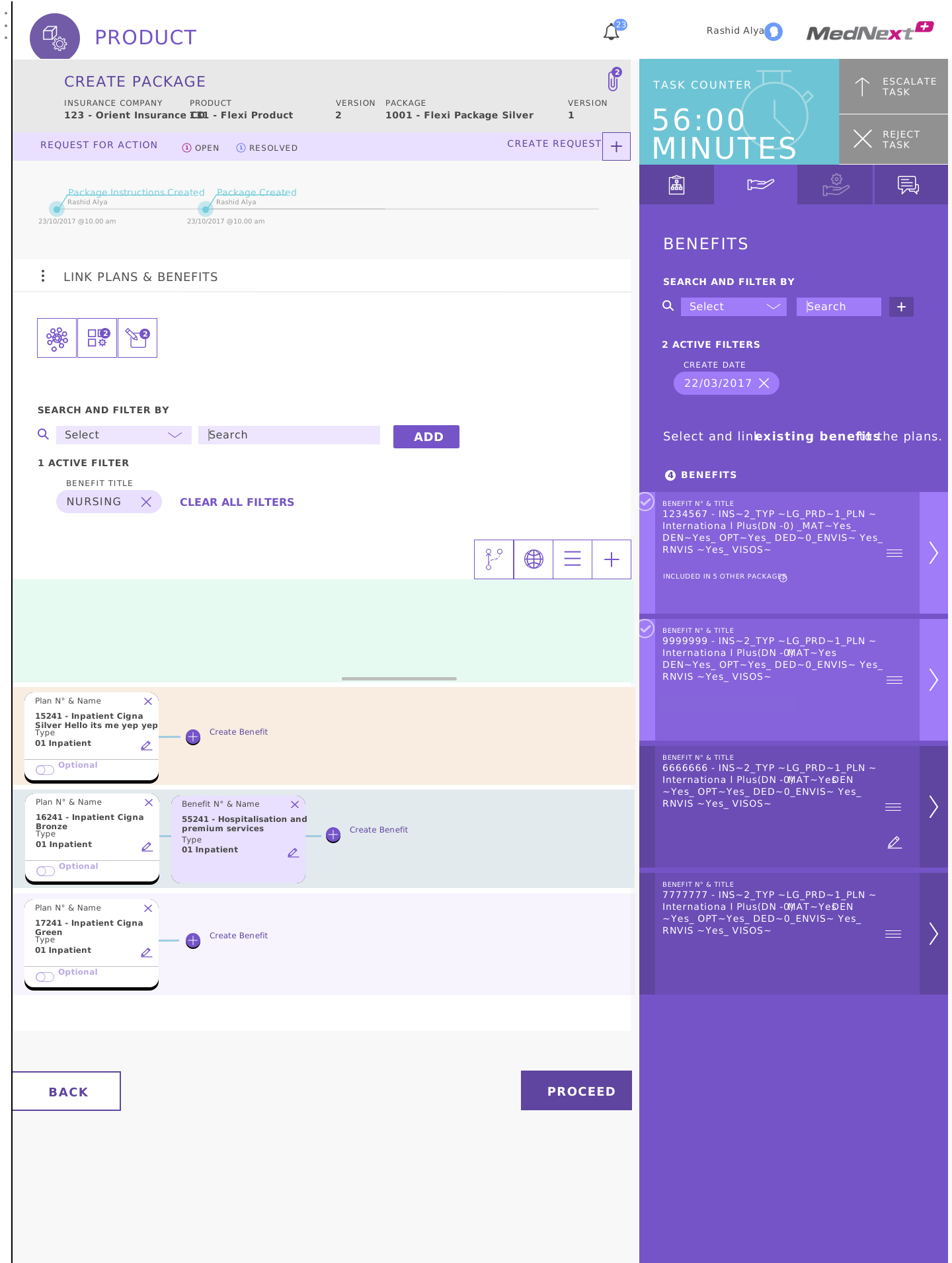
Drag and Drop Package Builder
WHAT IT REPLACES
A rigid, form-based workflow where users had to manually create every plan and benefit entry from scratch. Typing IDs, looking up definitions in separate screens, and assembling packages with no visual feedback until the very end.
WHY WE INVENTED IT
Building an insurance package is fundamentally an act of composition. Selecting plans, attaching benefits, adjusting combinations. We designed a canvas where users drag existing plans to reuse and modify them, or build new ones and attach benefits one by one. The right-hand panel surfaces existing benefits from across the platform, so users assemble packages from proven components rather than starting from memory. For the first time, the structure of a package is visible while you're building it — not after.
the outcome.
We brought design thinking into an organisation that had operated for 25 years without a design team. For the first time, product decisions were shaped by user research and usability evidence; shifting the culture from engineering-led to user-informed.
in recovered productivity / year
87% task completion (from under 50%). Despite entirely new patterns, users completed core tasks on first encounter. ~240 min saved per configuration × ~200 users × 220 days. [est.]
faster specialist onboarding
From 12 weeks to 4. A +43% satisfaction increase confirmed the redesigned module nearly eliminated the learning curve. [est.]
in training costs eliminated over 3 years.
The module became self-serviceable. €43K/yr direct savings plus trainer opportunity cost. [est.]
validation.
This is what we've been asking for. I can finally see the package the way I think about it, not the way the system thinks about it.
Anonymus
Usability Test Participant
future thinking.
AI Copilot concept
If I owned this product today, I'd build an AI configuration copilot on top of the redesigned model.
Insurers describe a new package in their own language. The system proposes a configuration. The user adjusts and approves.
The conceptual flip we shipped was the precondition. An AI couldn't have worked on the old mental model, because the old model didn't speak insurance. The next step is moving from clearer syntax to conversational intent.

my role & team.
Tuesday insight ⟶ Thursday wireframe
Senior UX Researcher & Designer, leading the Product Configuration Module redesign and three additional modules (Quotation, Enrolment, Claims Adjudication). I was the only person on the team doing both research and design. That meant the insight from a job shadowing session on Tuesday directly shaped the wireframe I tested on Thursday. Working closely with business analysts and engineering. Majority UI design; research conducted where BAs needed to shed light on unknowns. Interactive prototyping and usability testing with internal users were frequent.

reflection.
This project shaped how I think about feedback. Working in a complex domain with deeply established workflows, I learned that pushback often means people are invested, not opposed. Over time, I found my stride working as part of a wider team beyond UX, and that shift in perspective became a foundation for how I approach cross-functional collaboration today.

